


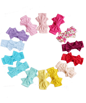

Our Top 5 Basics
Our top 5 probably won’t surprise you. Spoiler, they’re Black, White, Red, Navy Blue and Dark Pink. Keep scrolling to see a selection of basics in each colour and learn a little bit about the Super Power of each one.
We did a little more research and indentified the complementary colour for each of our top 5.
When you’re pairing colors, you can find harmony through choosing complementary colors. In this case, opposites attract. This particular color scheme draws from two colors on the opposite side of the color wheel. When you do this, the result is a high-contrast color combo that’s bright and that pops. Keep this in mind when searching for the right pairable item in your wardrobes.
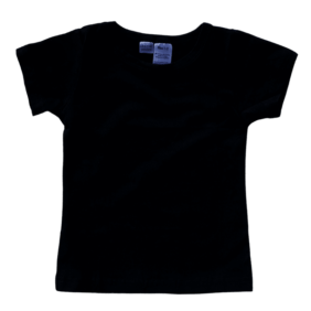
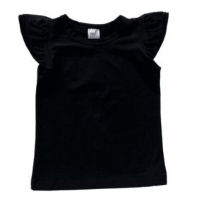
1. Black
The color black represents strength, seriousness, power, and authority. Black is a formal, elegant, and prestigious color. Authoritative and powerful, the color black can evoke strong emotions.
White is the complimentary colour for Black
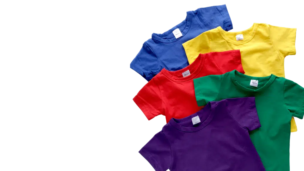
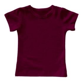
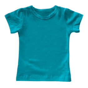
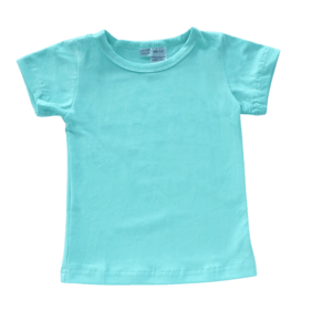
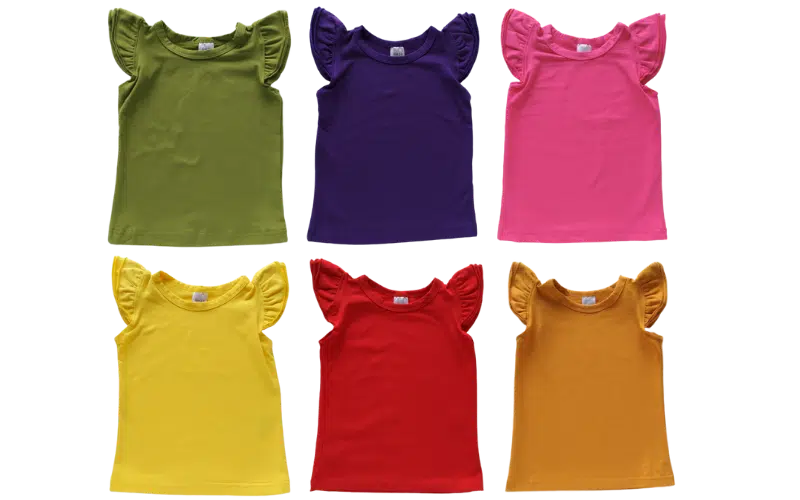
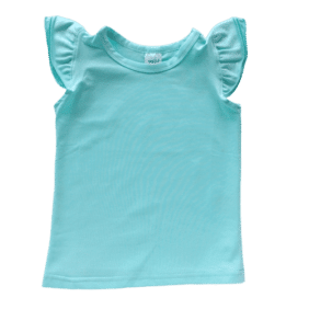
Basic Tops
Sale!
Blankish
Sale!
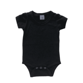
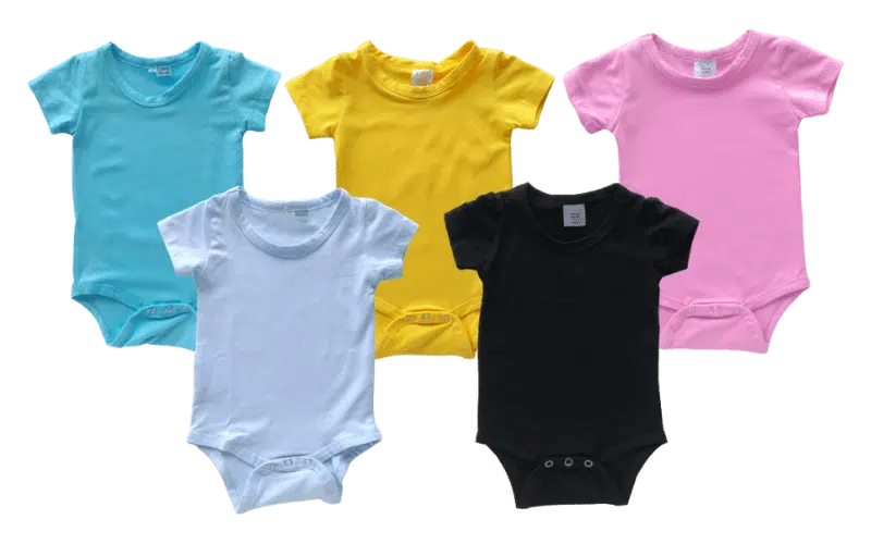
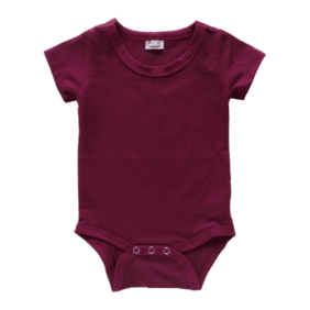
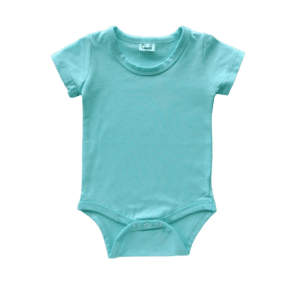
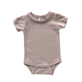
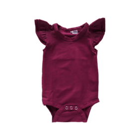
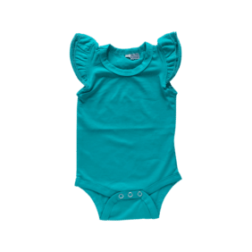
Basic Bodysuits
Basic Bodysuits
2. White
The colour white can convey simplicity. White often seems like a blank slate, symbolizing a new beginning or a fresh start
Black is the complimentary colour for White

Basic Tops
Blankish
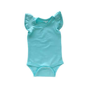
Basic Bodysuits
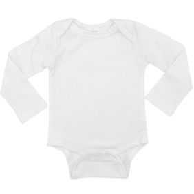
Basic Bodysuits
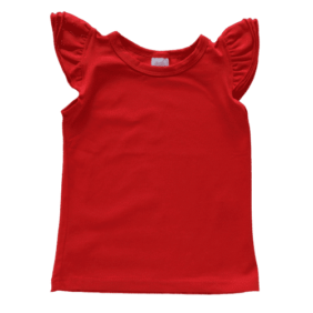
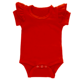
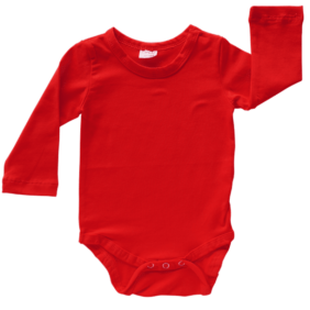
3. Red
Scientists at the University of Durham published research in 2005 that showed that athletes who wore red were more likely to beat their opponents: ‘We find that wearing red is consistently associated with higher probability of winning,’ wrote Russell Hill and Robert Barton.
Red’s associated with urgency, danger and power. That sounds like a potent combination that you might want to step lightly around, and you’d be right. You should use red sparingly. But you should absolutely use it!
Blue is the complimentary colour for Red
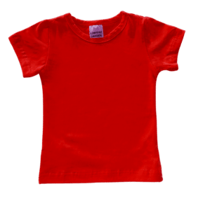
Basic Tops
Blankish
Blankish
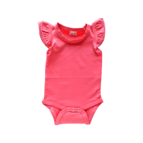
Basic Bodysuits
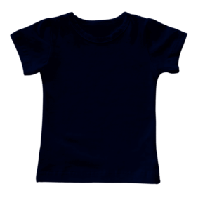
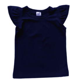
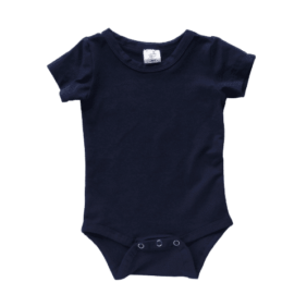
4. Navy Blue
Navy conveys importance, confidence, power, and authority, as well as intelligence, stability, and unity. Like black, it carries a sense of elegance and sophistication.
Yellow is the complimentary colour for Navy Blue
Sale!
Basic Tops
Sale!
Sale!
Basic Bodysuits
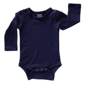
Basic Bodysuits
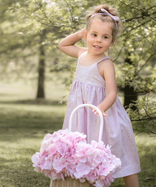
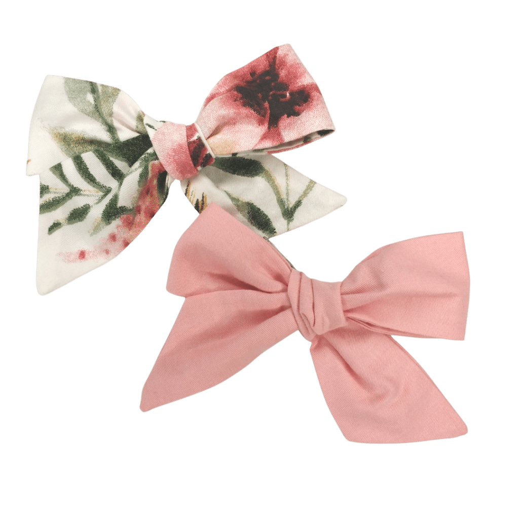
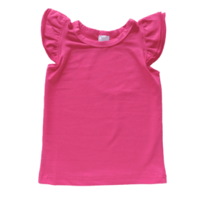
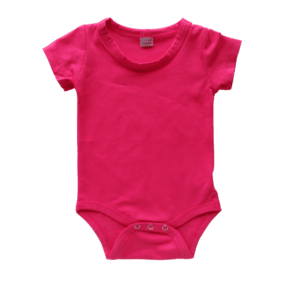
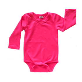
5. Bright Pink
Pink is thought to be a calming color associated with love, kindness, and femininity. Many people immediately associate the color with all things feminine and girly. … Some shades of pale pink are described as relaxing, while very bright, vibrant shades can be stimulating.
Green is the complimentary colour for Dark Pink
Sale!
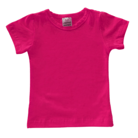
Basic Tops
Sale!
Sale!
Basic Bodysuits
Basic Bodysuits
Color can affect us in unexpected ways. It can:
If it can do all that, what else can it do?
Our Complimentary Colours
White
Black
Ocean Blue
Bright Yellow
Jungle Green